A look at the development of the unpublished versions of Coal Face.
Key skills: Writer and creator. Concept art. Storyboards. Dialogue. Narrative design. Publishing.
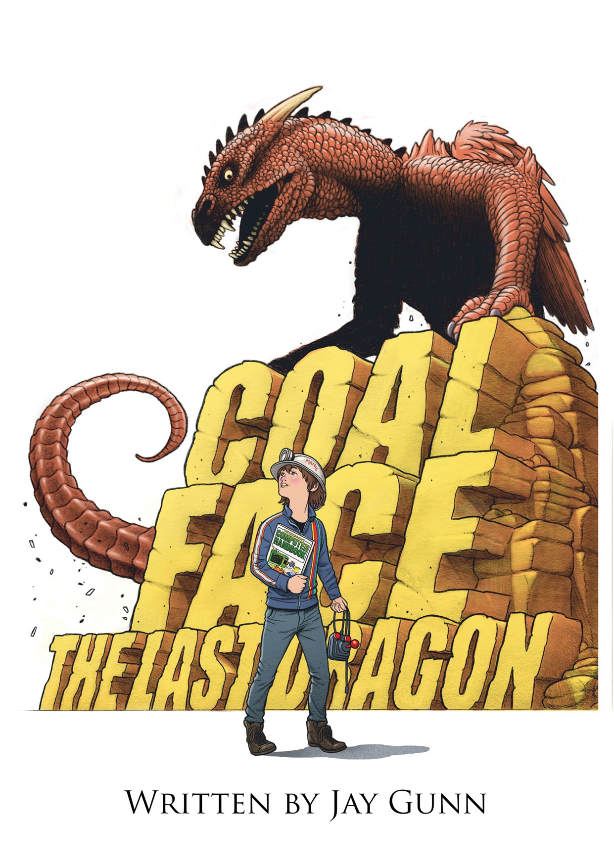
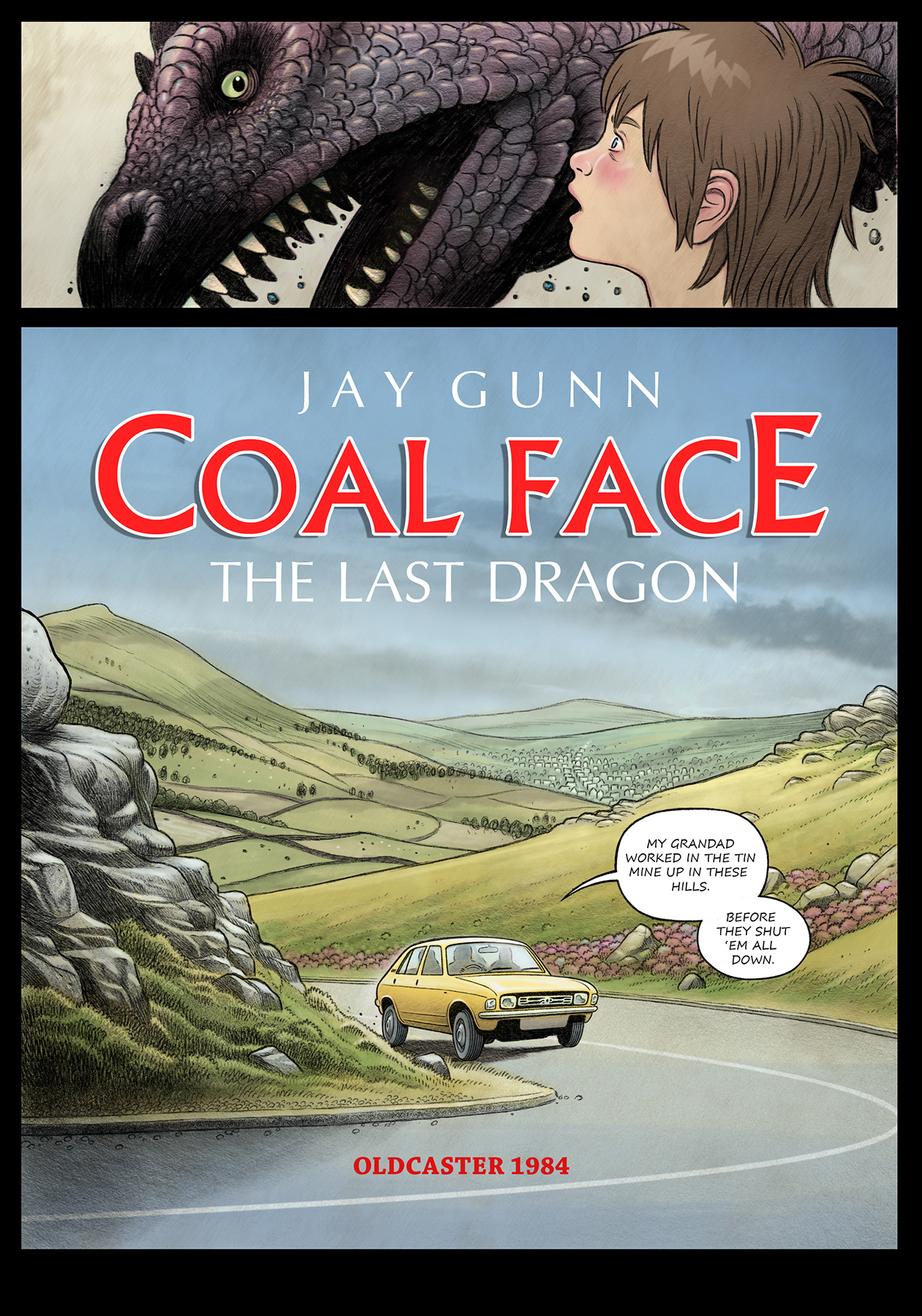
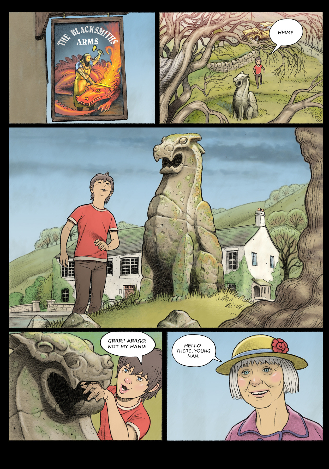
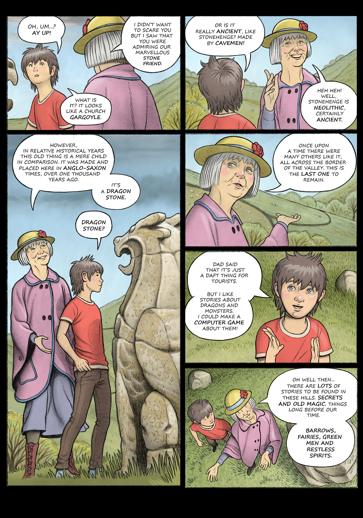
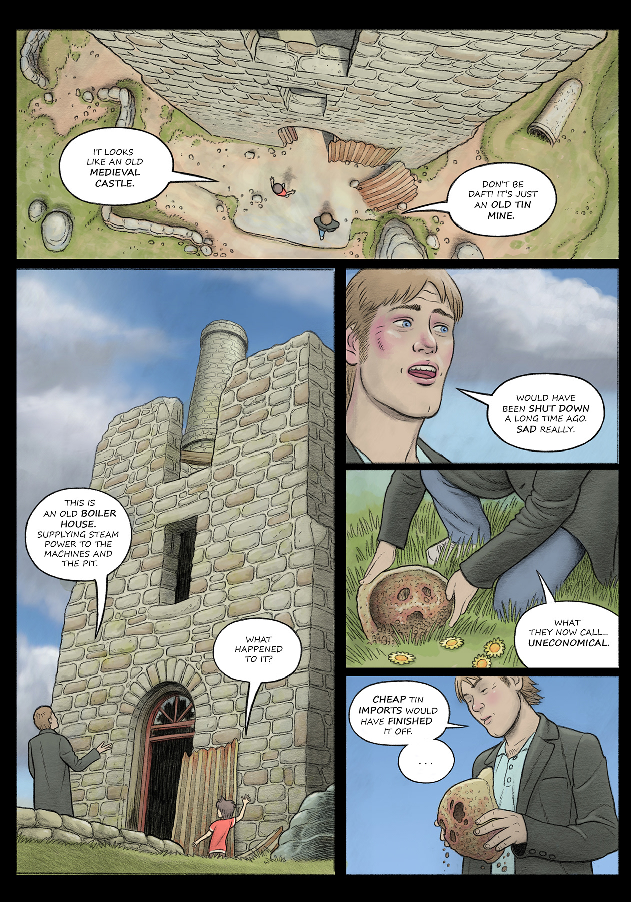
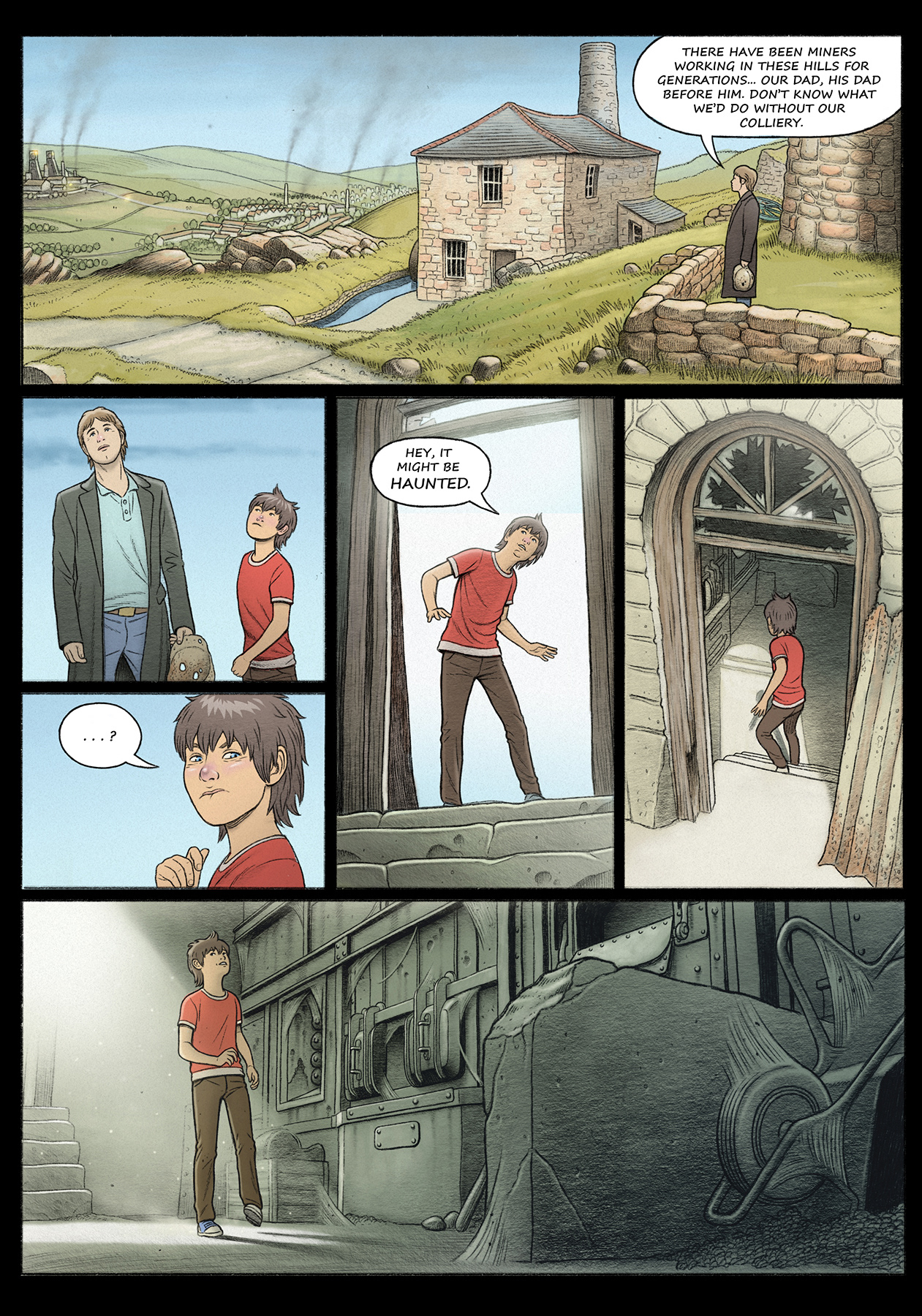
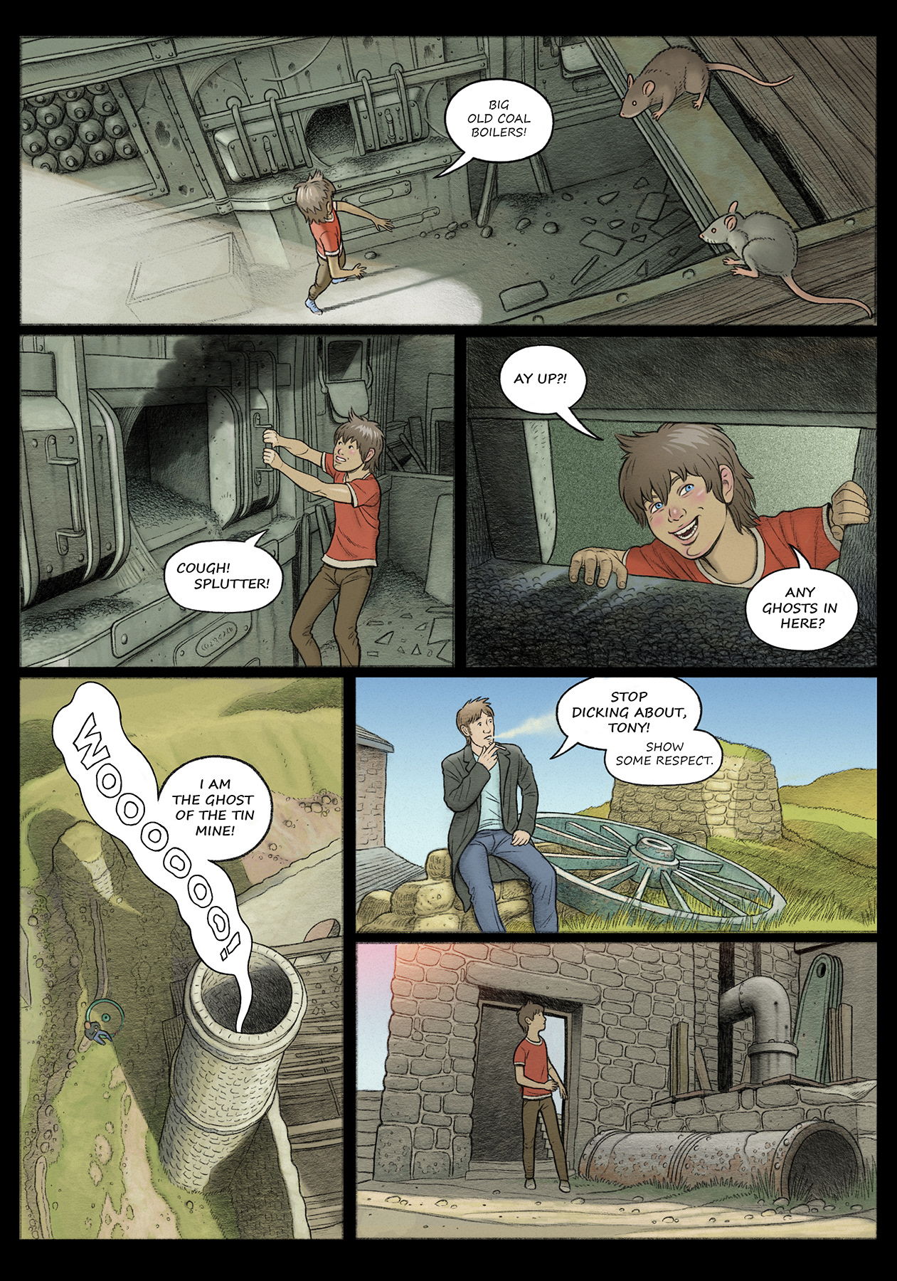
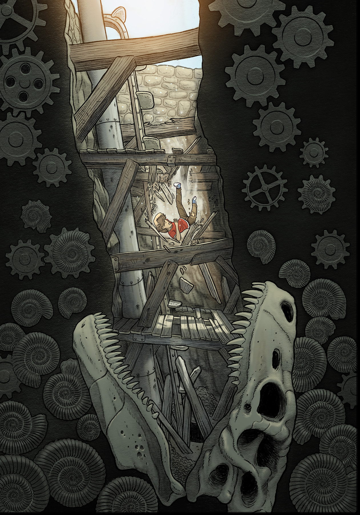
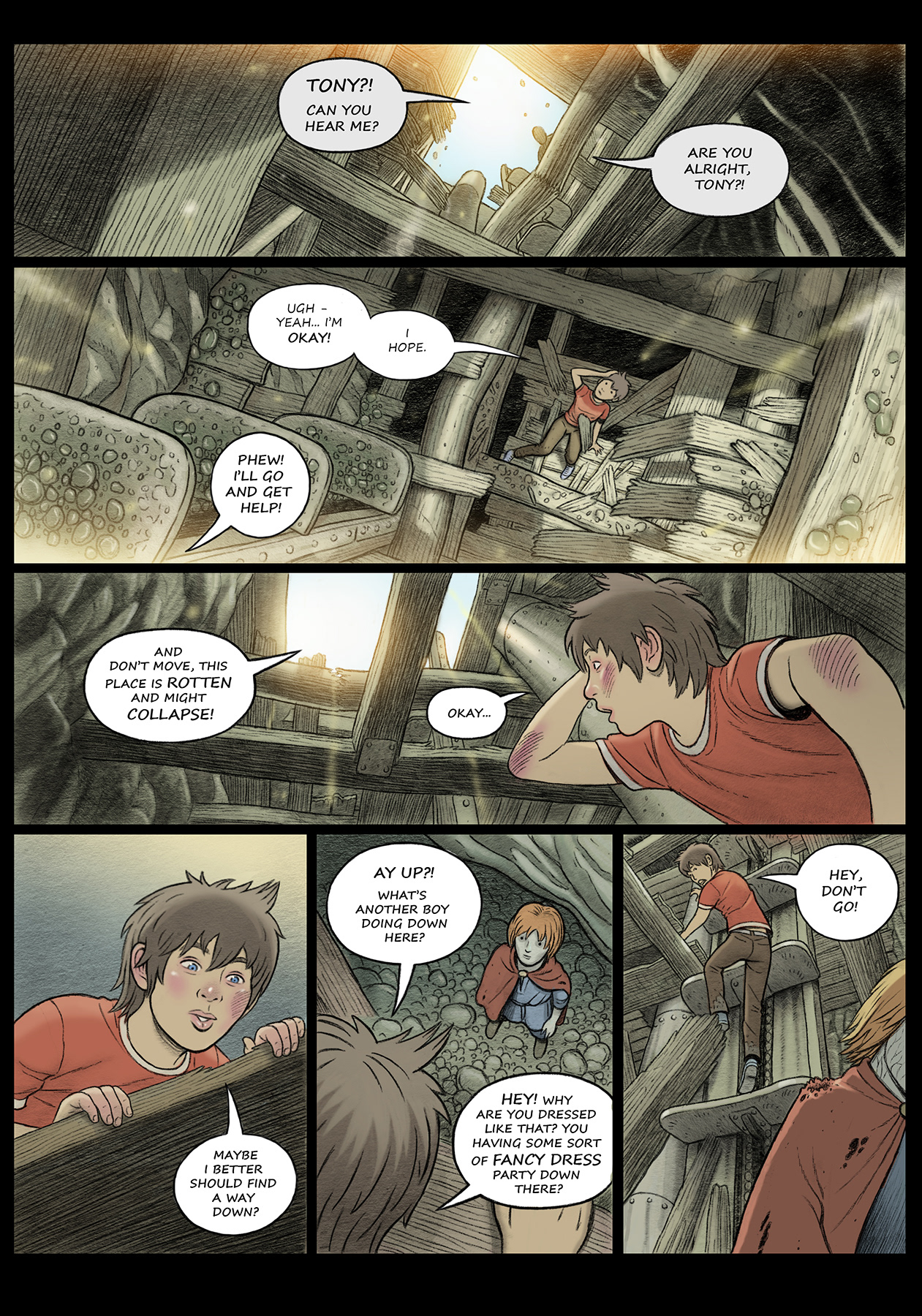
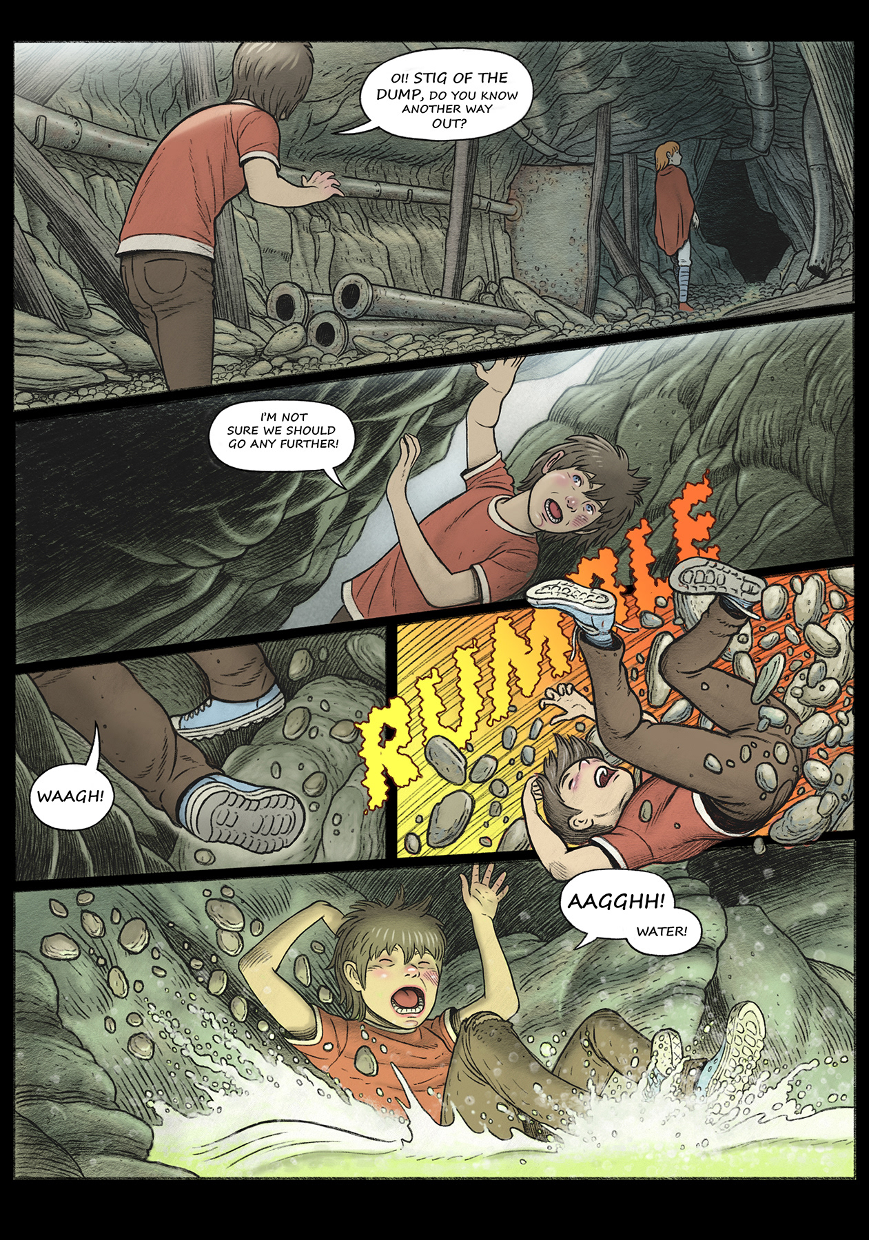
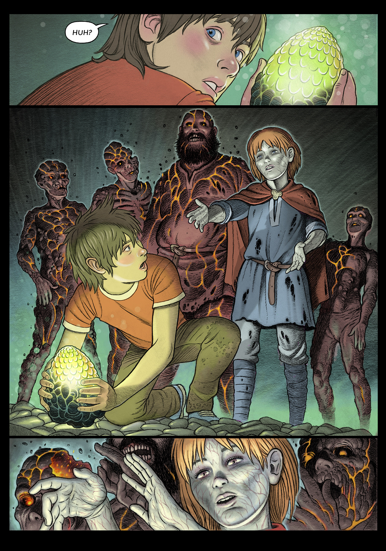
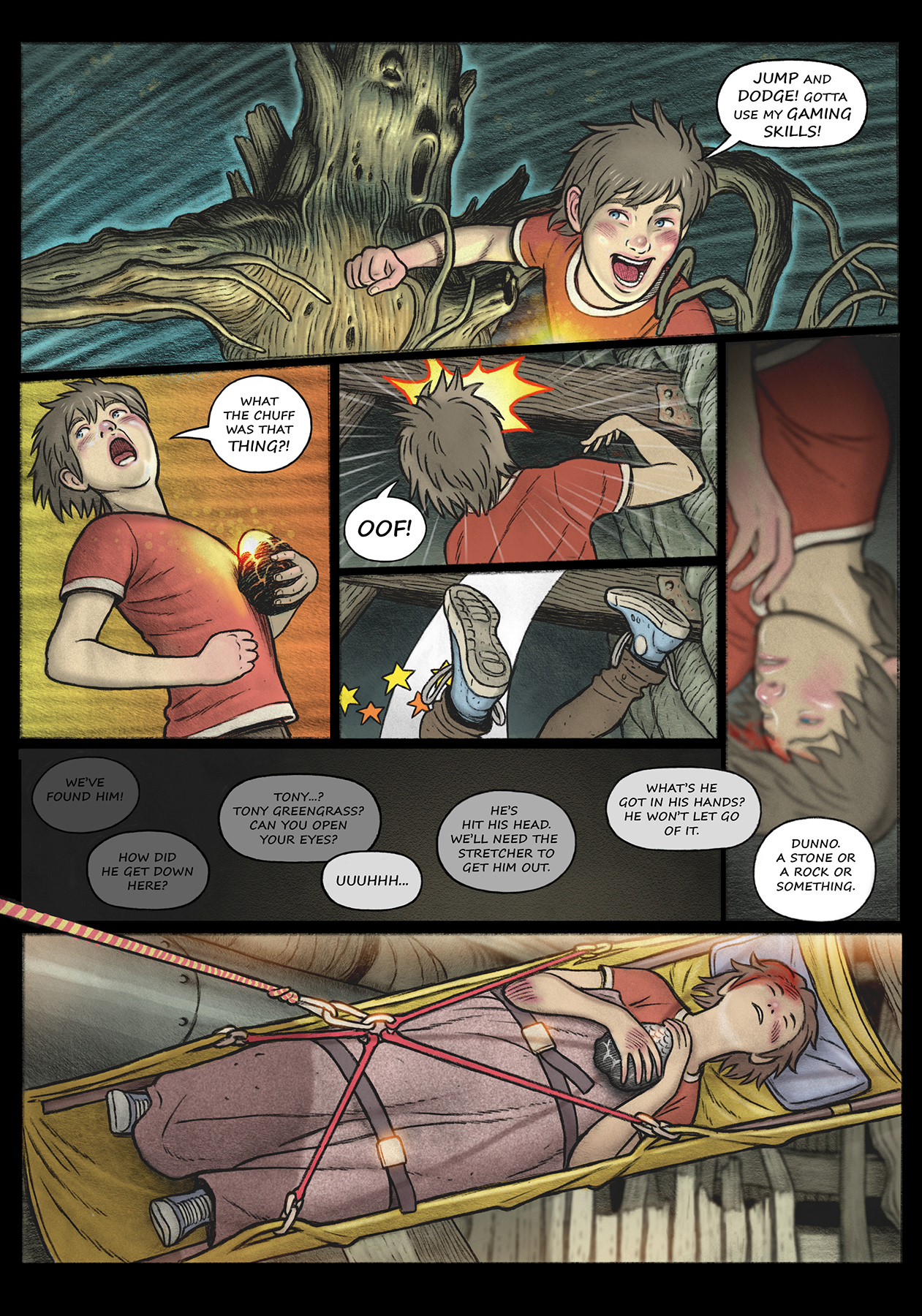
Coal Face – The devil in the smoke originally started life as a graphic novel: Coal Face – The Last Dragon.
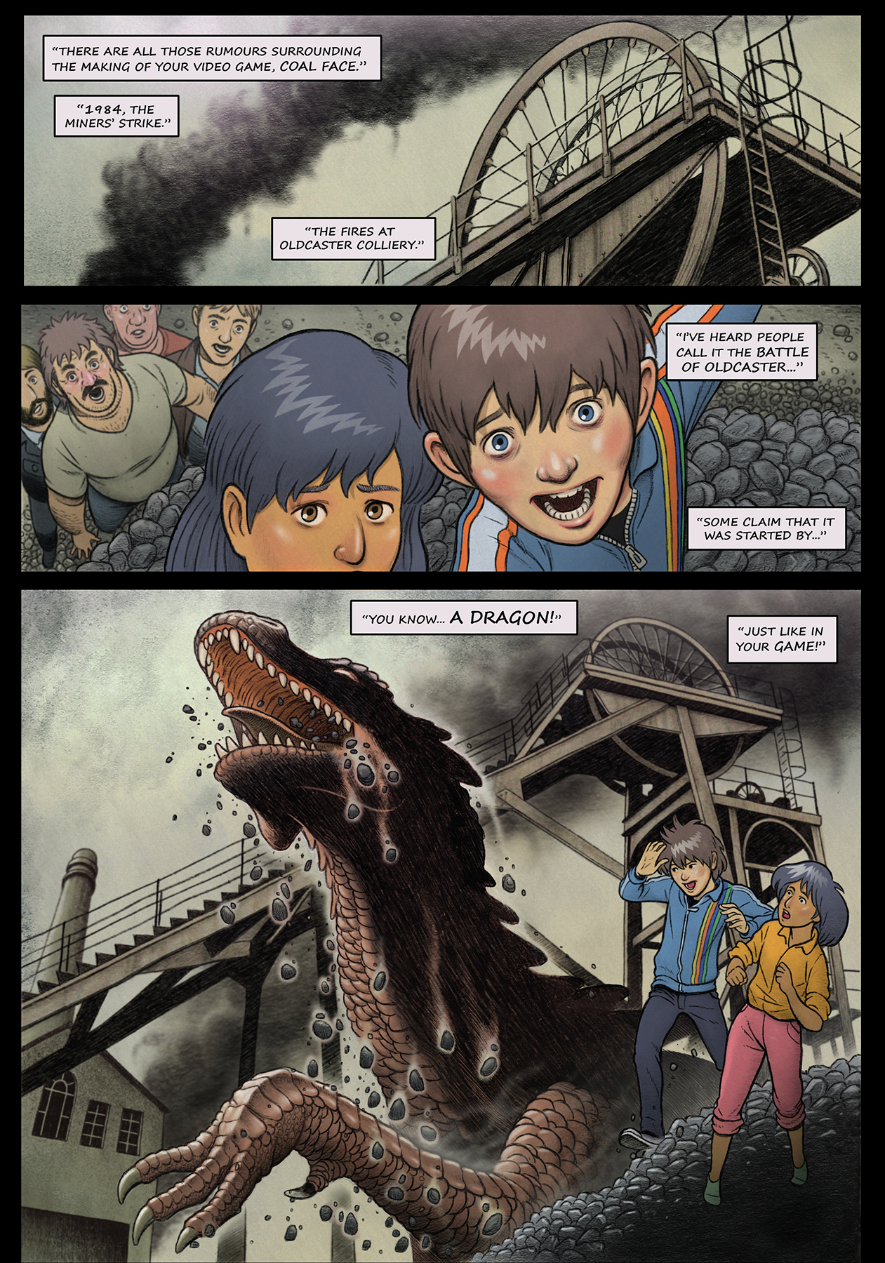
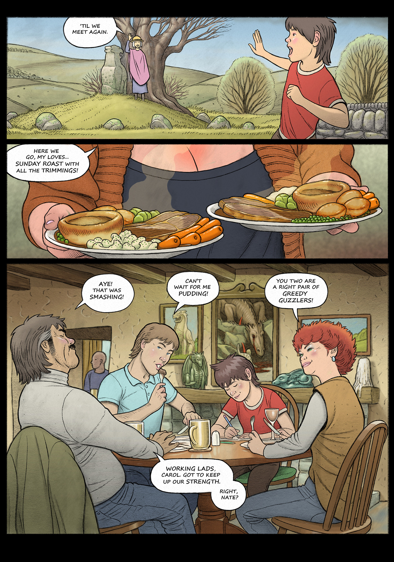
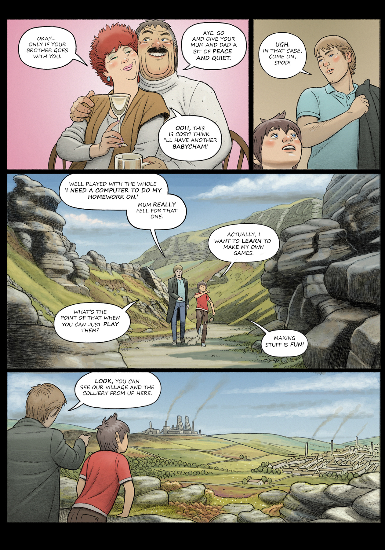
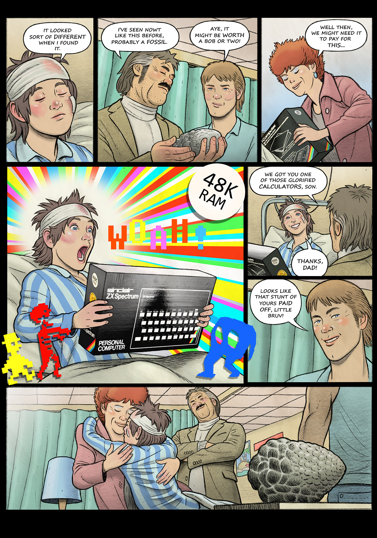
A fantasy monster story set during the tensions and violence of the yearlong miners’ strike of 1984. A young boy and a girl from a fractured mining village find themselves the unwitting custodians of a coal eating dragon hatched from a fossil found in an abandoned mine shaft. The growing dragon becomes increasingly hostile as coal supplies dwindle and the strikes turn violent.
My inspirations were the works of Raymond Briggs, Studio Ghibli, Ken Loach, Ray Harryhausen and the video games of the era.

Process: I wanted to tell a fantasy story, based on my personal experiences, about the conflicts and the tensions that lay at the heart of a rapidly imploding traditional working class environment. A story viewed through the eyes of children that used the allegory of a dragon to represent a beleaguered community that relied on damaging fossil fuels for its survival.
However, stories featuring working class themes featuring unemployment were deemed to be out of fashion for most book publishers at the time and a steady stream of rejections followed. For the second rewrite of the story I gender swapped the lead boy character to a girl, thus Tony became Nicole. I liked this more female-centric version of the story but it was not enough to convince publishers.
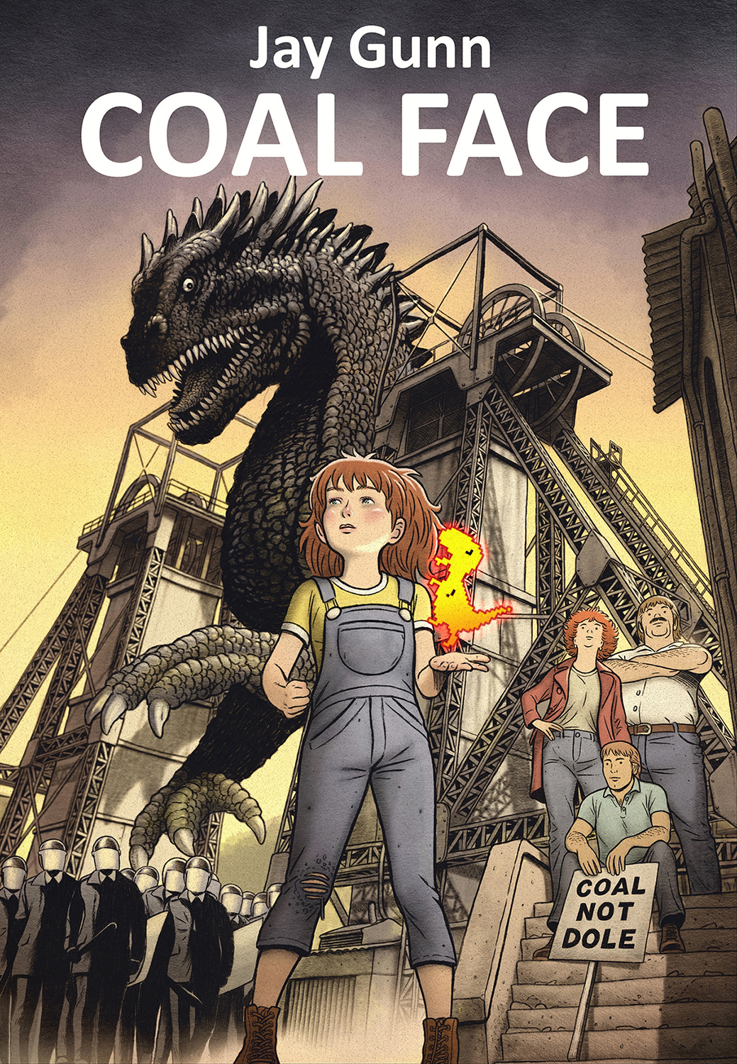
The gender swapped version of Coal Face - Tony is replaced with Nicole, the daughter of a striking coal miner.
Conclusion: And so, I scrapped the entirety of the comic book and started a complete rewrite from scratch during lockdown. The revised darker tone and themes of the newer version of the book were to become rather prescient during its release in the winter months of 2022/23. A winter in which many struggled with energy poverty and hunger, many more workers were striking for better pay and working conditions, and the environmental perils of fossil fuels were once more back in the headlines. We had once more returned to the dark days of 1984.
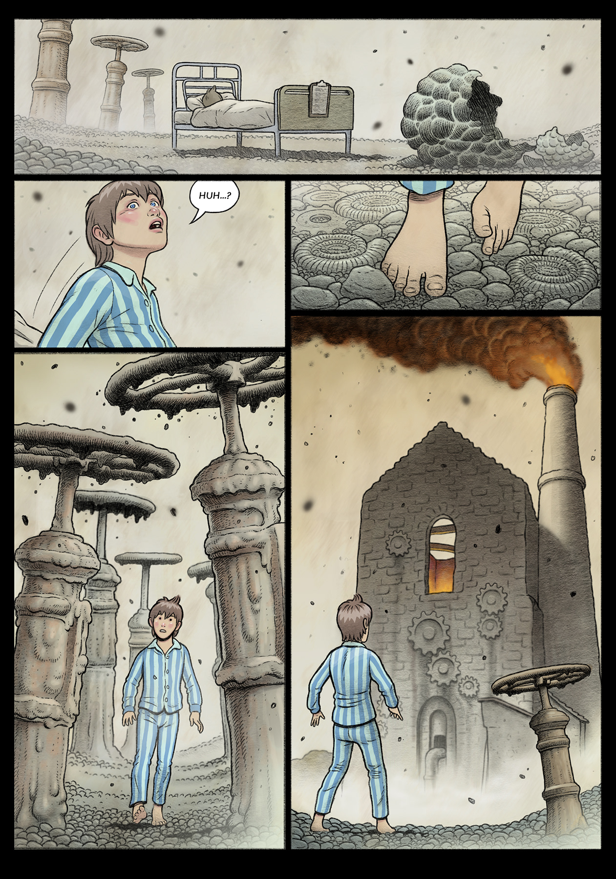
Art Direction: In terms of approaching an art style for the two versions of the story it was an interesting design exercise. The original versions (seen here) was much lighter and whimsical in tone, visually leaning into the more colourful childlike perspective of the story narrative.
Whereas the released version became much more nightmarish and sinister in tone, full of foreboding shadows and presented in charcoal industrial textures that resembled soot and smoke.
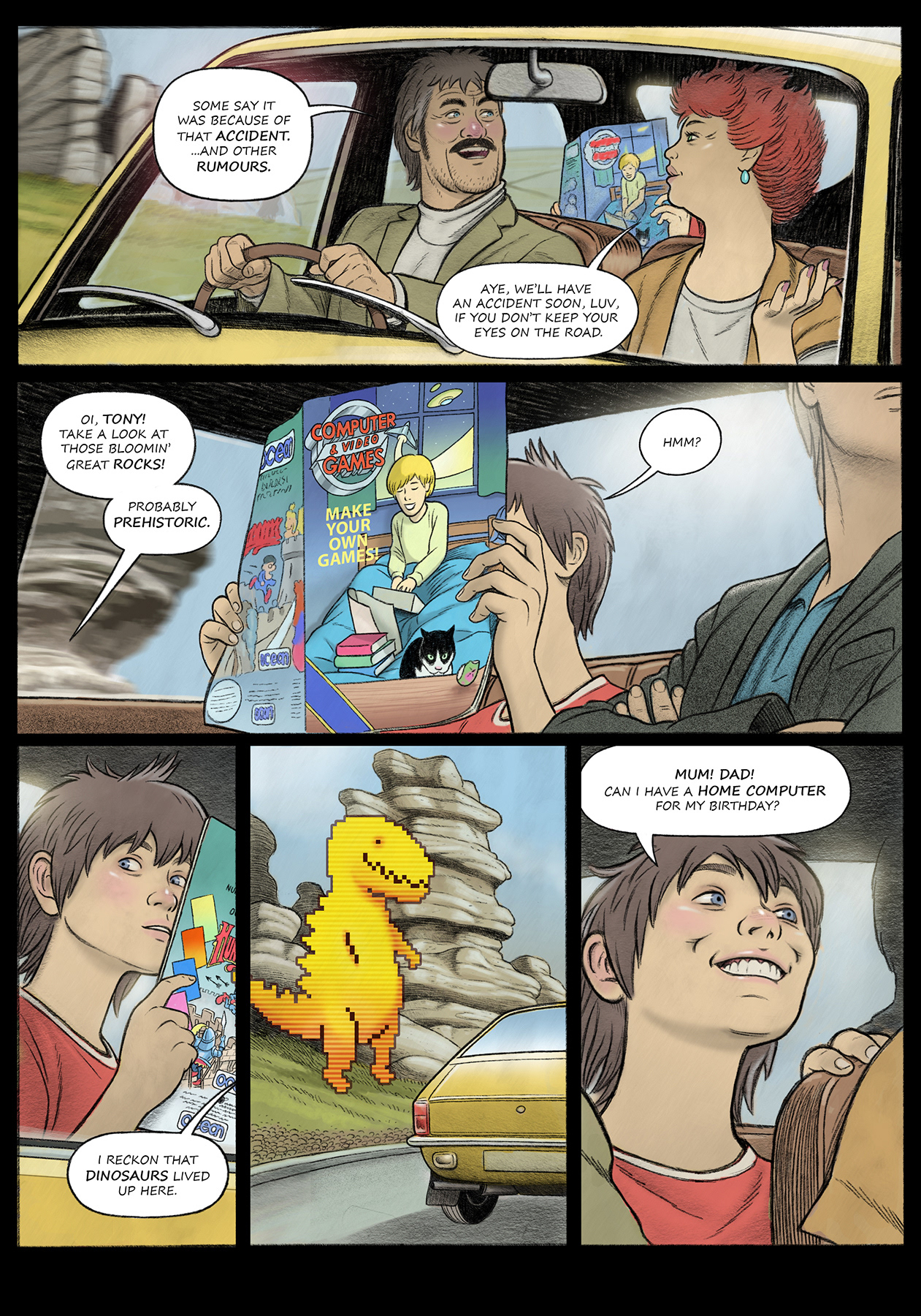
The following pages (in sequential order) is the first chapter of that unpublished work.